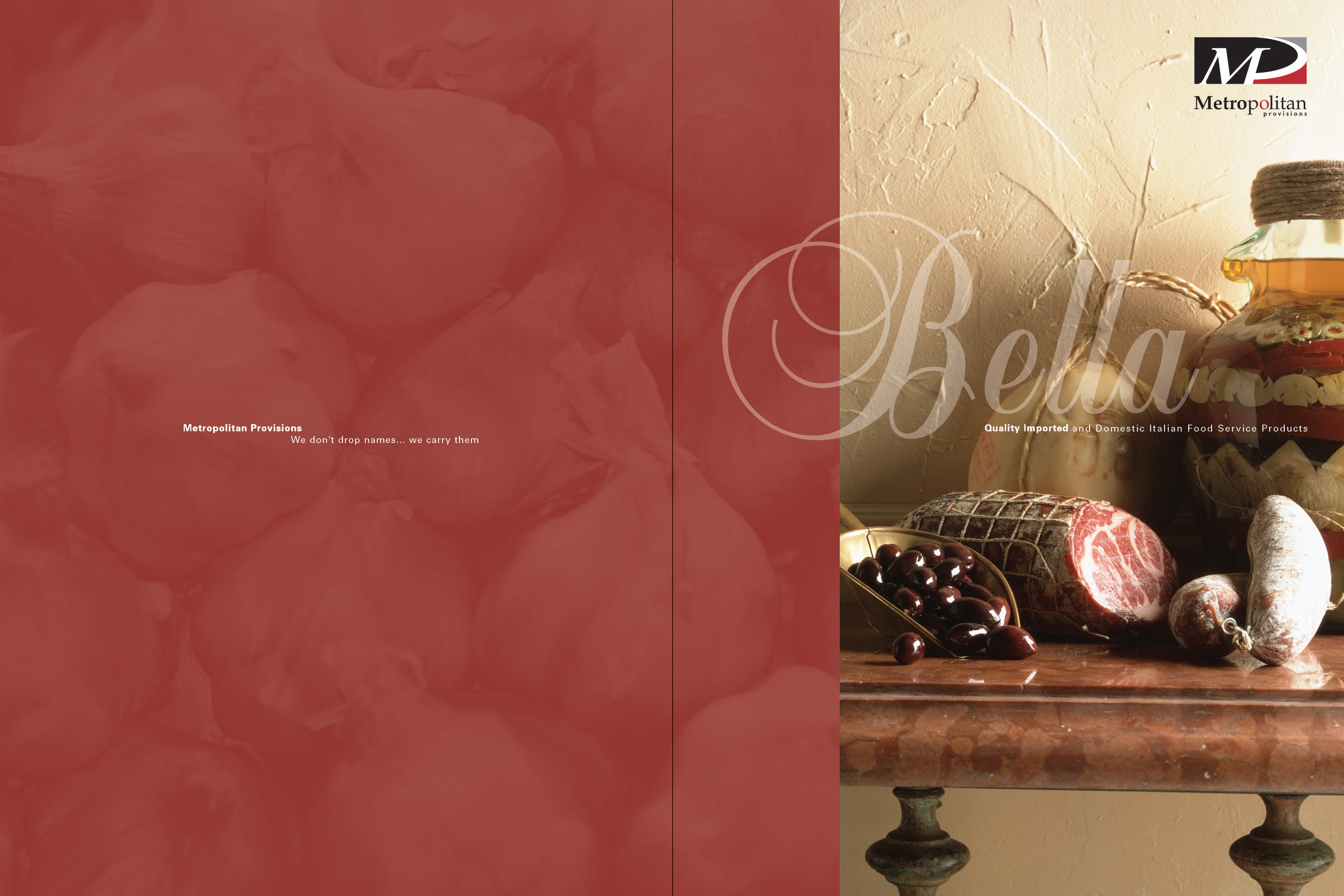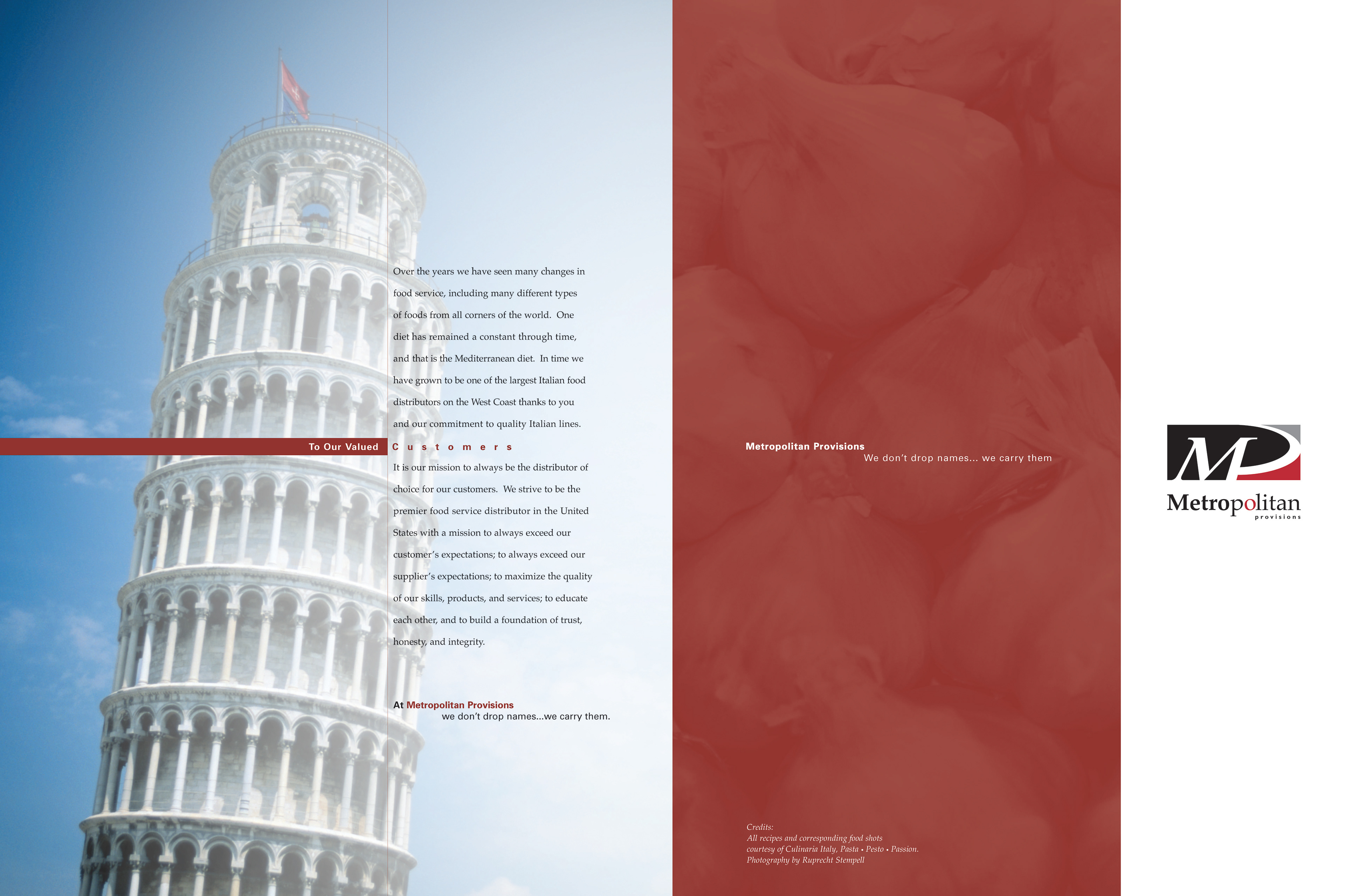
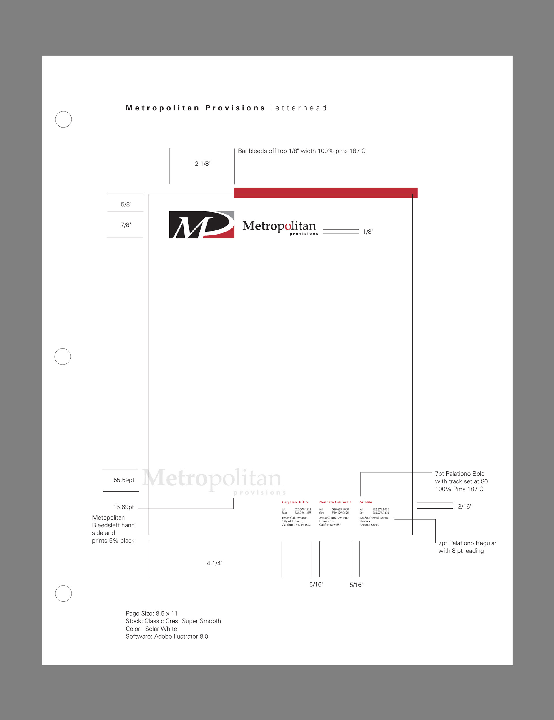
Metropolitan Provisions
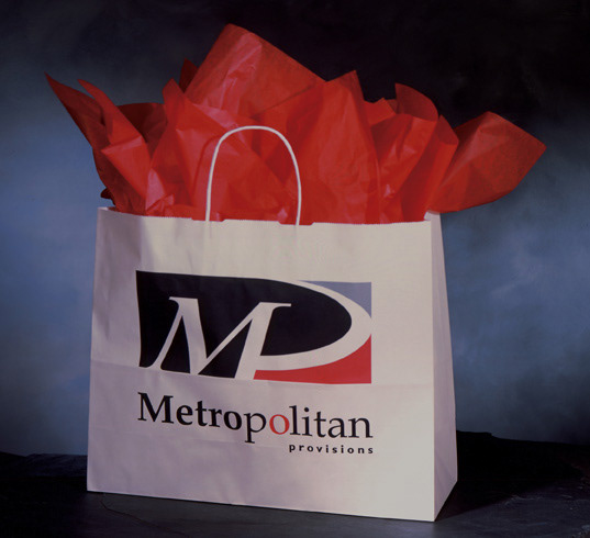
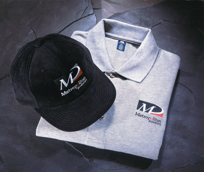
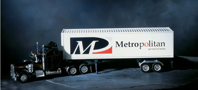
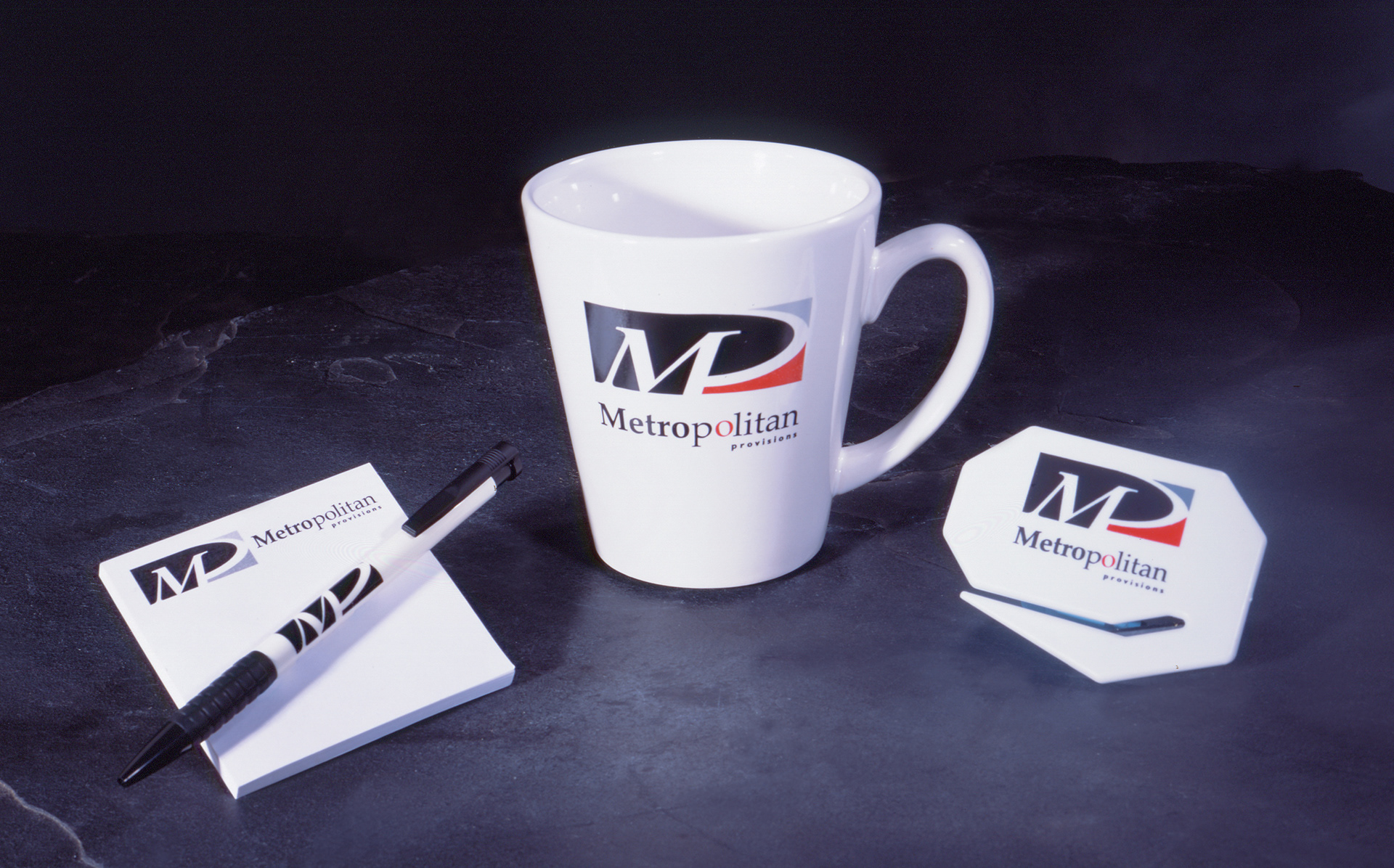
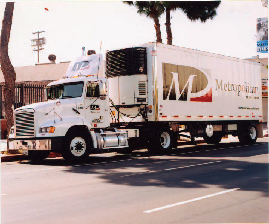
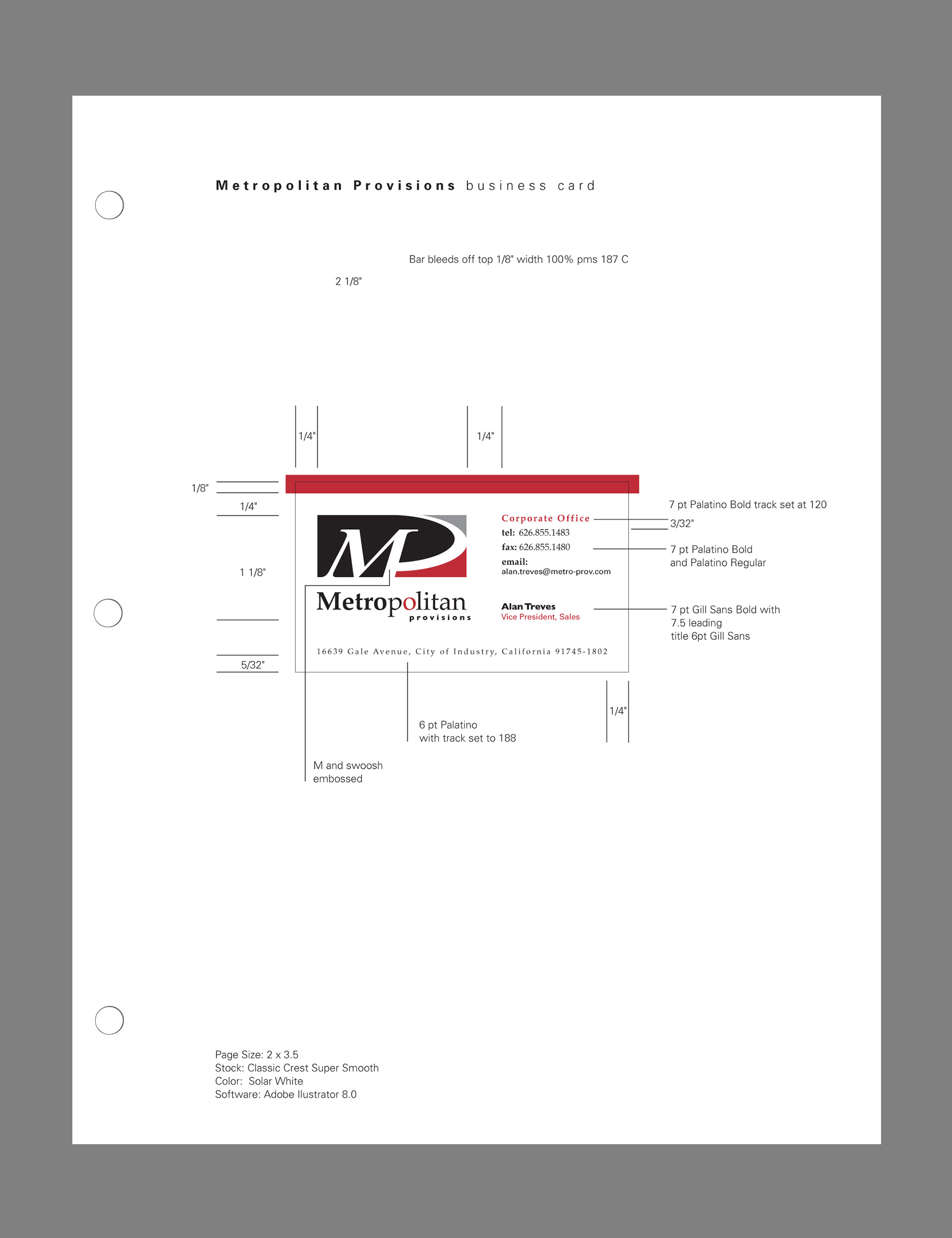
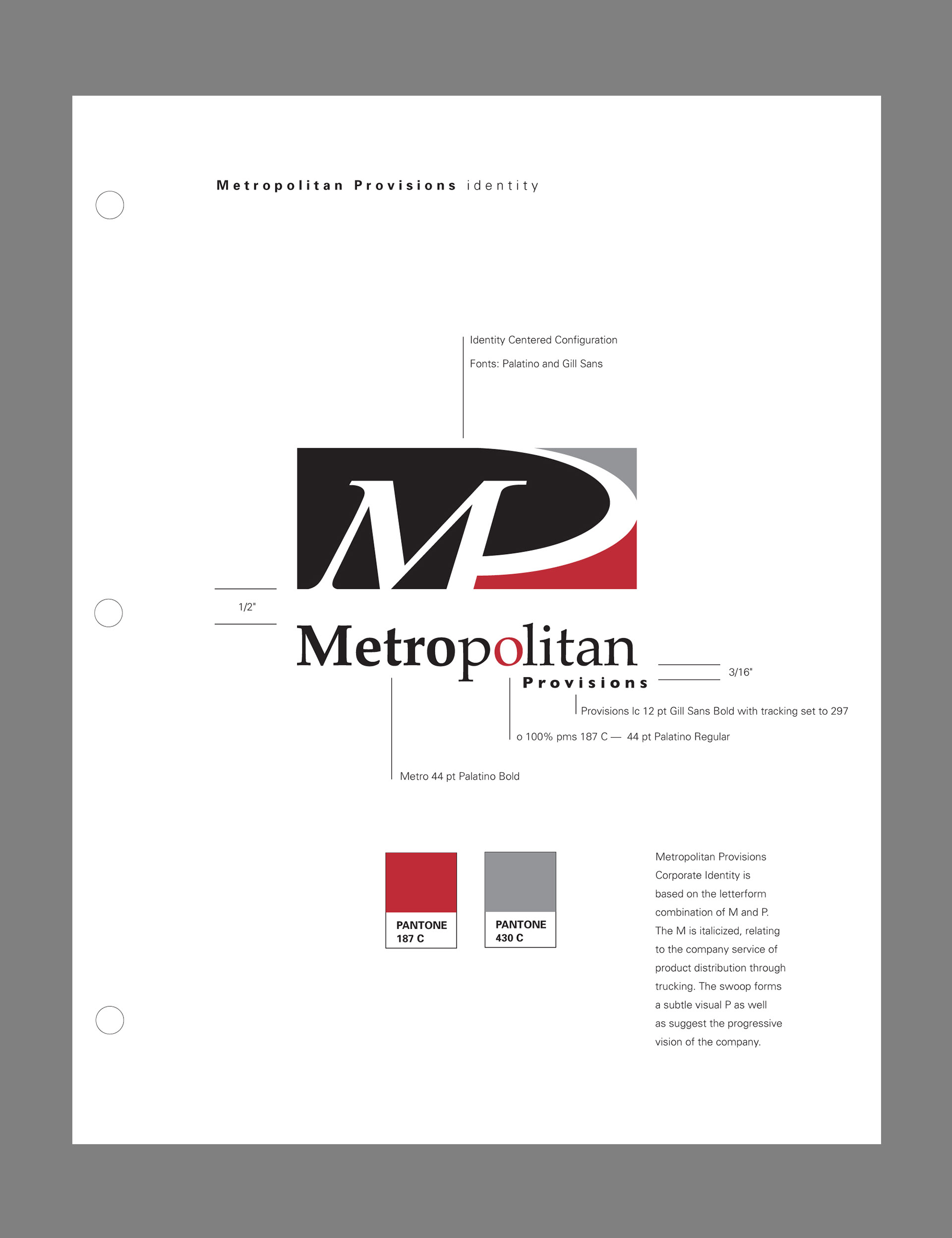
Metropolitan Provisions, a broadline food distributor, wanted their identity to be bold, memorable, and relate to their product distribution via fleet transportation. The letterform combination, using an italicized M and a swoop to form a P, suggests movement. The swoop curve points upward to the company's vision of future growth in its industry.
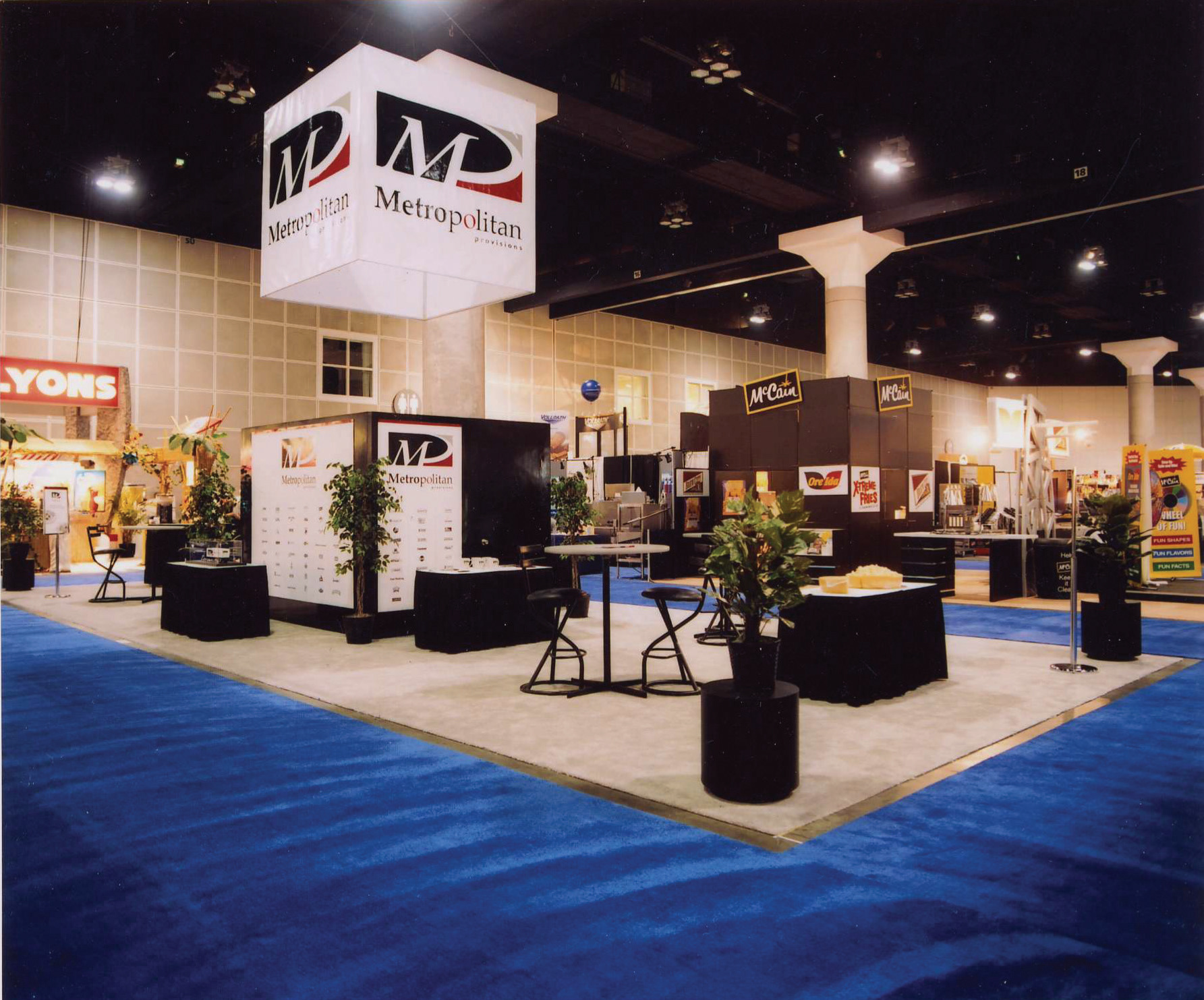
Application of Metropolitan Provisions identity to trade show booth, bobtail truck, wearables and giveaway promotional merchandise.
Corporate Standards Manual

Trade Show Manual Cover